How might a new food condiment brand break through the current market by offering a fresh approach to communicating the product's qualities without over-investing in resources?
I have always wondered why there is no originality in terms of package design when it comes to popular Philippine food condiments like pasta sauces, rice stews, and the like. Everyone follows the same color palette, the same food imagery, even the same typographic style.
My mom, a food chemist who has been in the industry for over 50 years, oversimplifies the rationale by saying: this is what people are comfortable with. Doing anything other than this would be frightening, and may risk consumer trial. Any attempt at a higher design quality than this would alienate the market, and think it is too expensive to consider.
Enter my brave concept condiment brand - Saucy. Seasoned Sauces for the Modern Filipino Palette.
Naming the brand came naturally, plucking out the word that offers not just a text book definition but also a colloquial term that complements the personality of the brand, as well as the intended consumer.
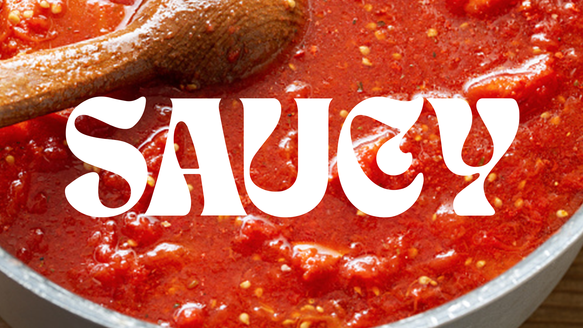
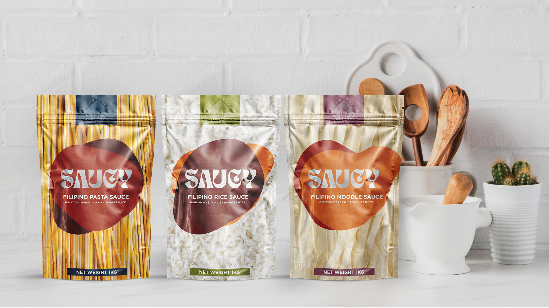
Saucy is not only oozing with sauce, but also a homonym to "sosi", a local term for having sophisticated taste. The typography and the use of minimalism and abstract elements lean in on this sophistication, because I believe the consumer is smart enough to put it all together, and consider trying the brand.
Filipinos love their sauces, and for practical reasons. We can transform one raw ingredient into a feast with a single bowlful of any sauce, and feed so much more of our neighborhood. This is why in our supermarkets, there are more than 2 aisles dedicated to sauces of all kinds, most typically shown in stand-up pouches too. Why? It's unbreakable, it's more portable, and it's most cost-efficient to produce.
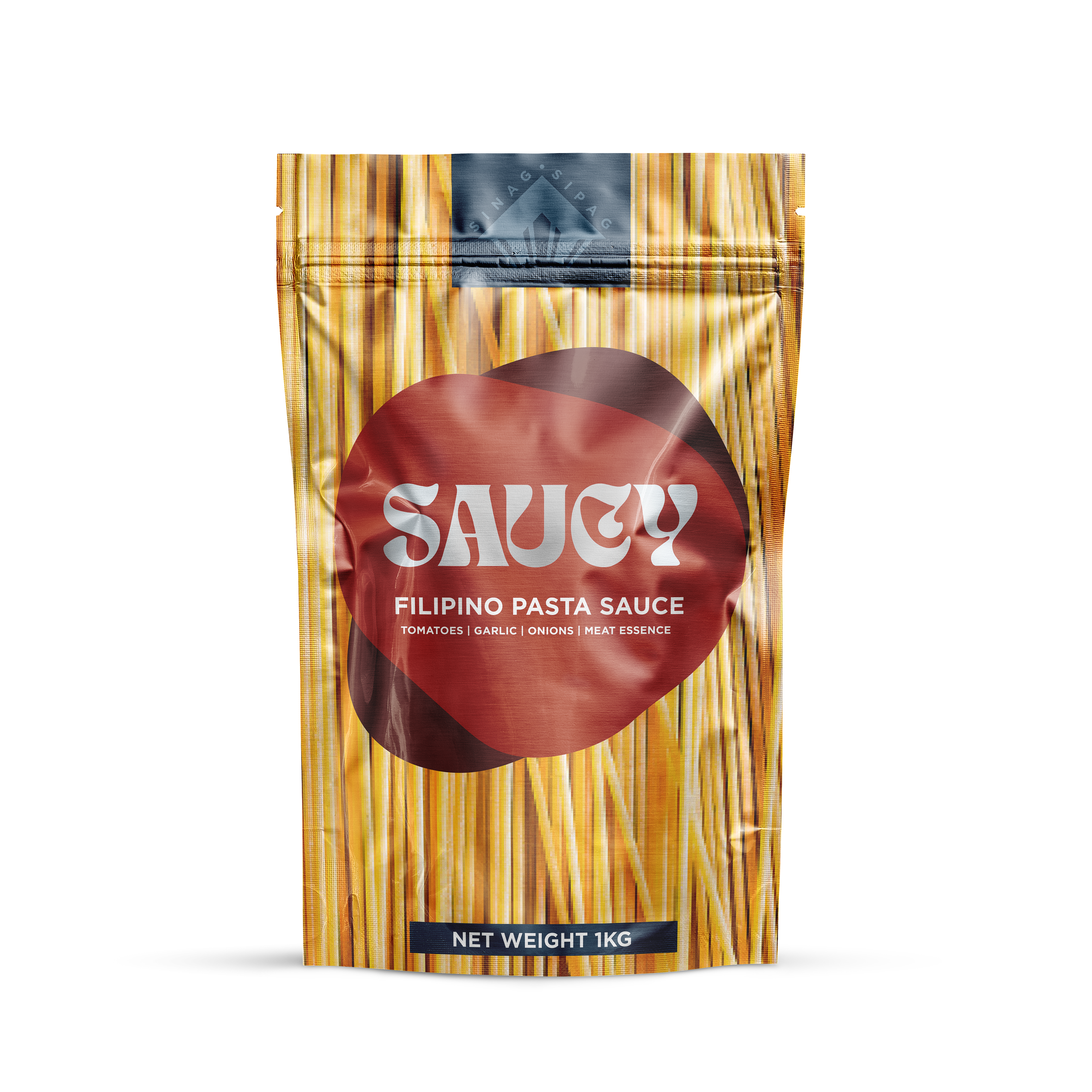
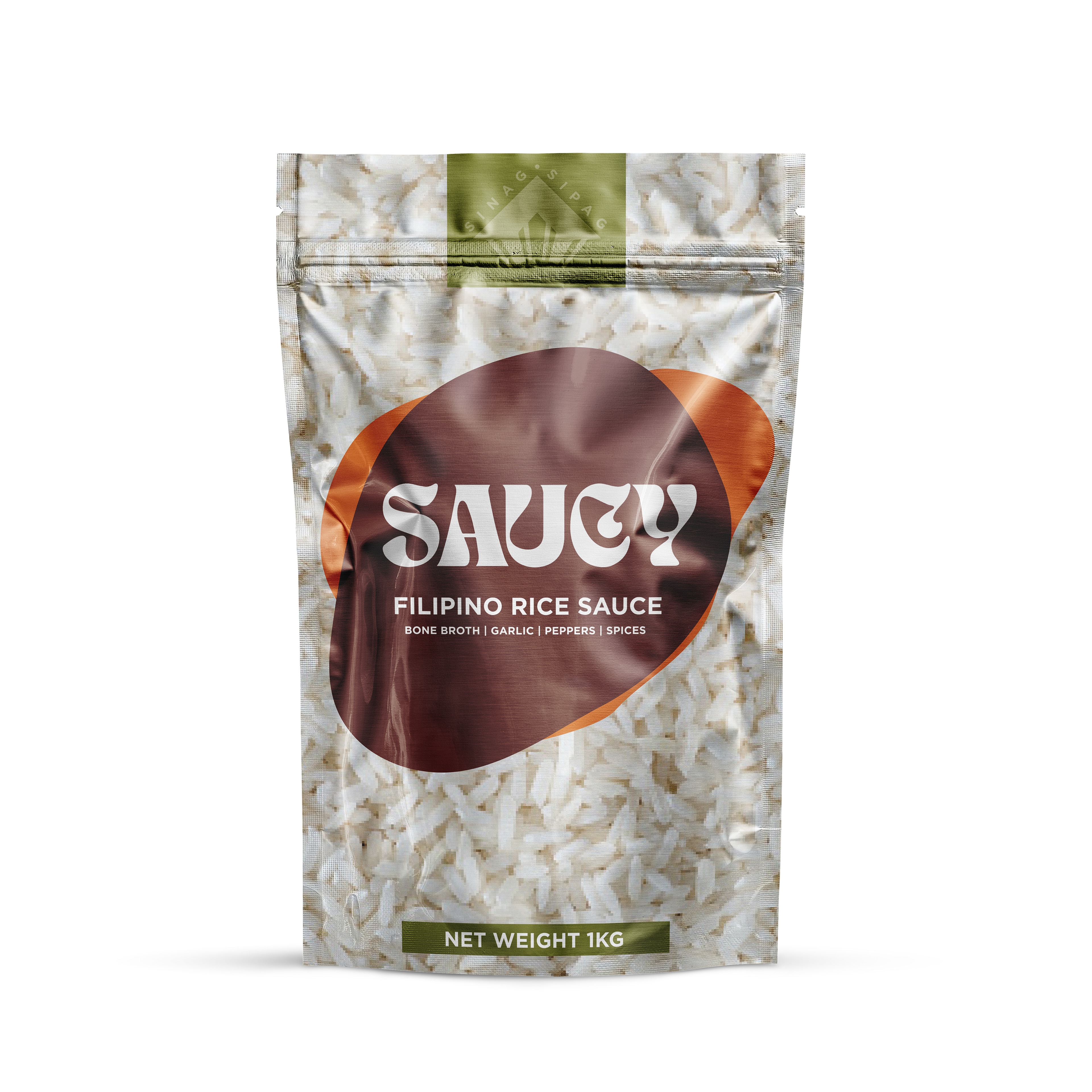
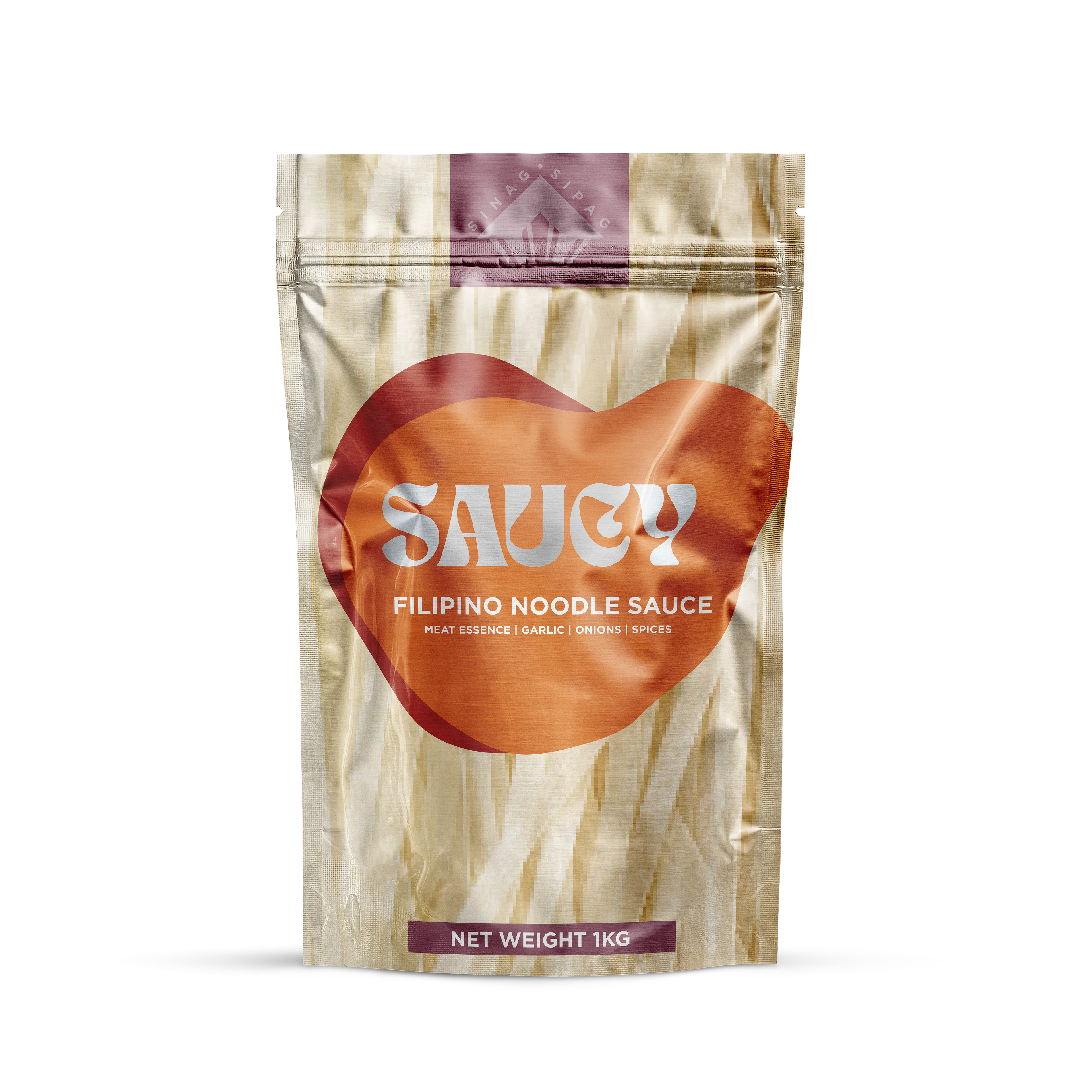
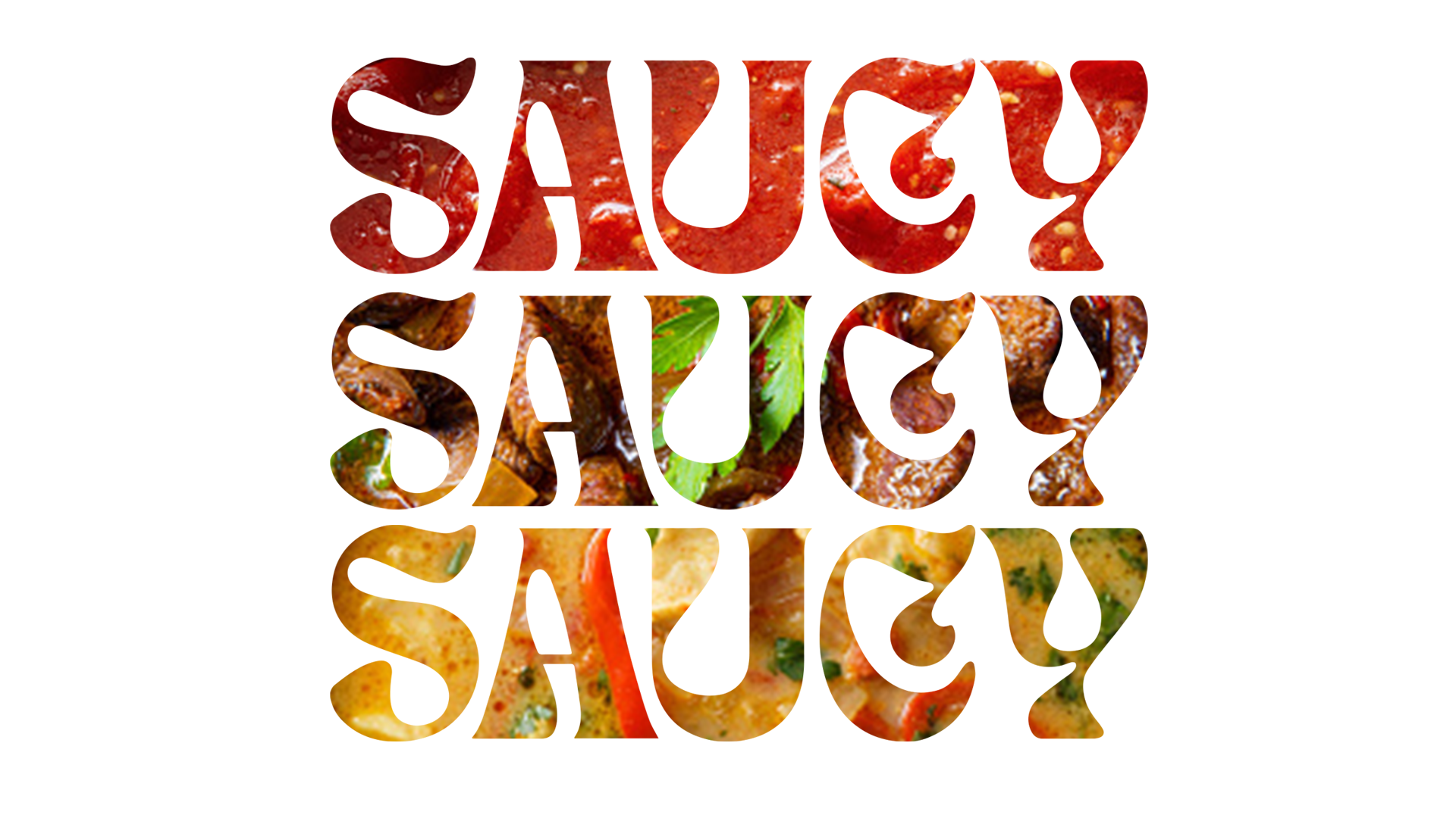
The visual system of Saucy relies very much on a consumer's existing knowledge of food. We've seen the same stock imagery of the finished product on a pouch to know that that's the expected outcome.
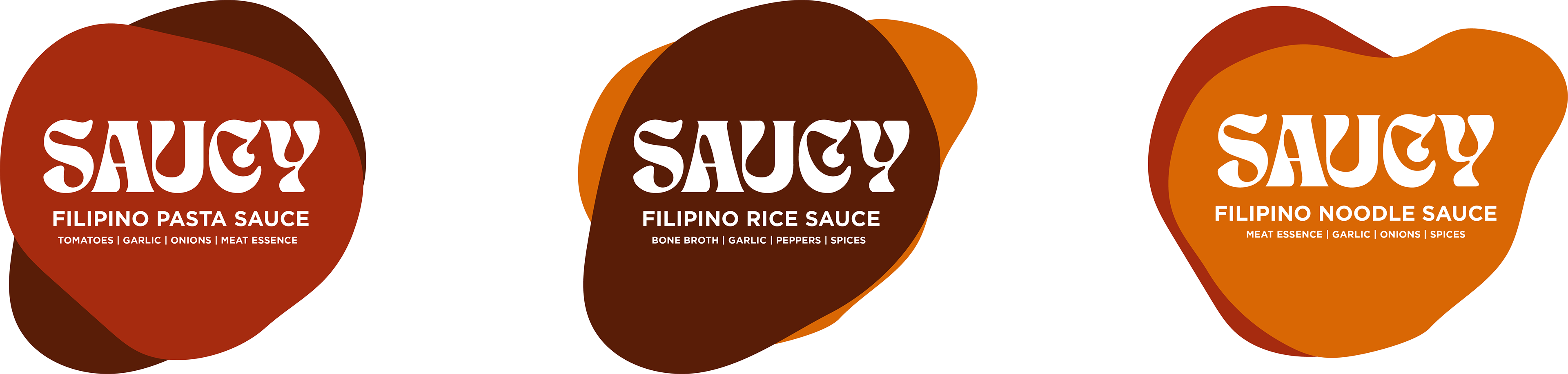
With this design, the base ingredient is the platform, and an abstract graphic element is on top of it, all to say that Saucy is in fact the sauce for this ingredient. This brand wants you to create your own final dish. It doesn't have to be the same old pasta, or the same old rice topping, or the same old noodles. We are simply giving you the tool to do whatever you want to.
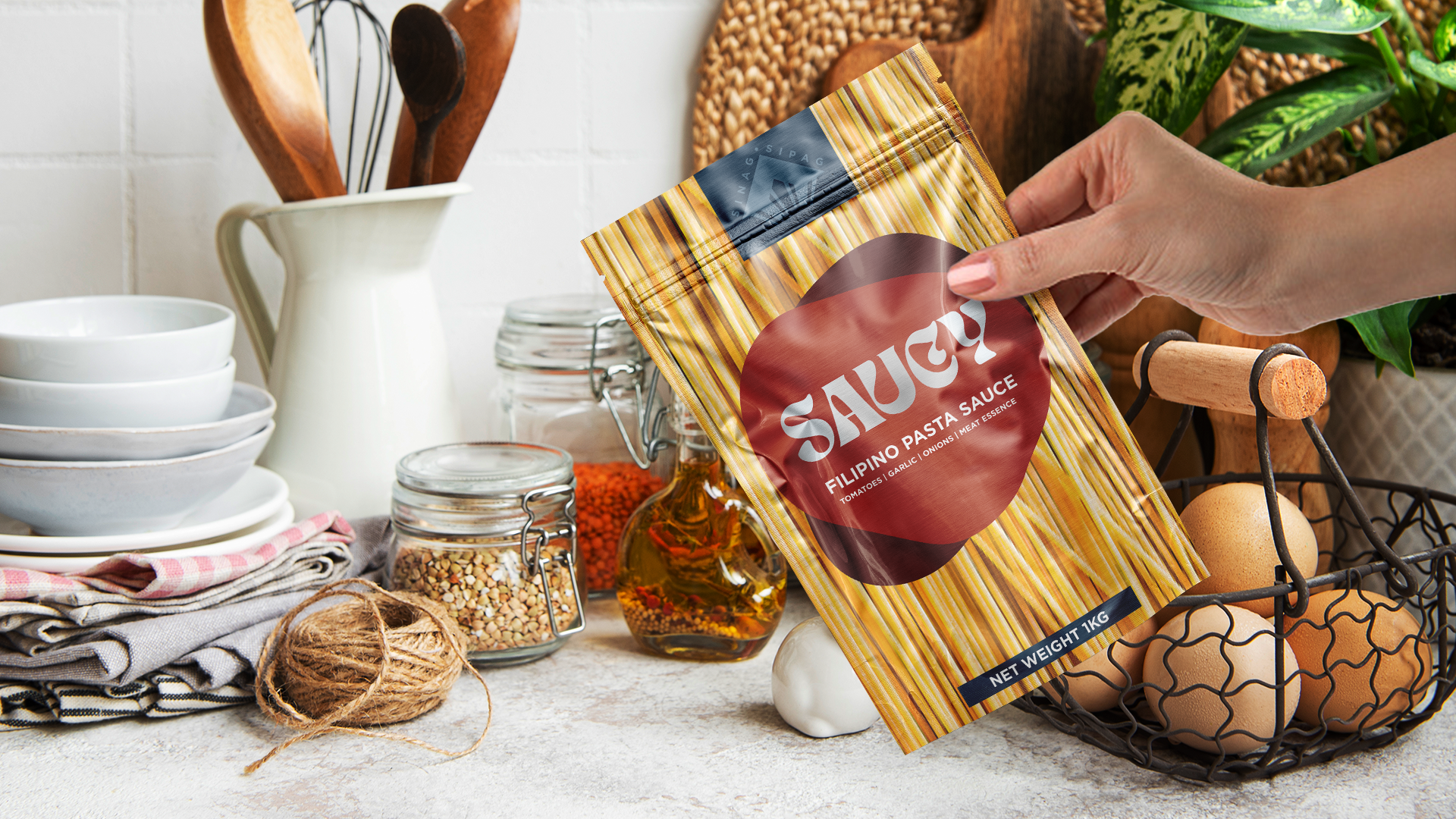
Stand-up pouches are usually printed full-color, but with Saucy, the main wordmark has no ink overlay, exposing the glossy metallic substrate. This is a simple way to elevate the package design, and create shine when the grocery lighting hits it.
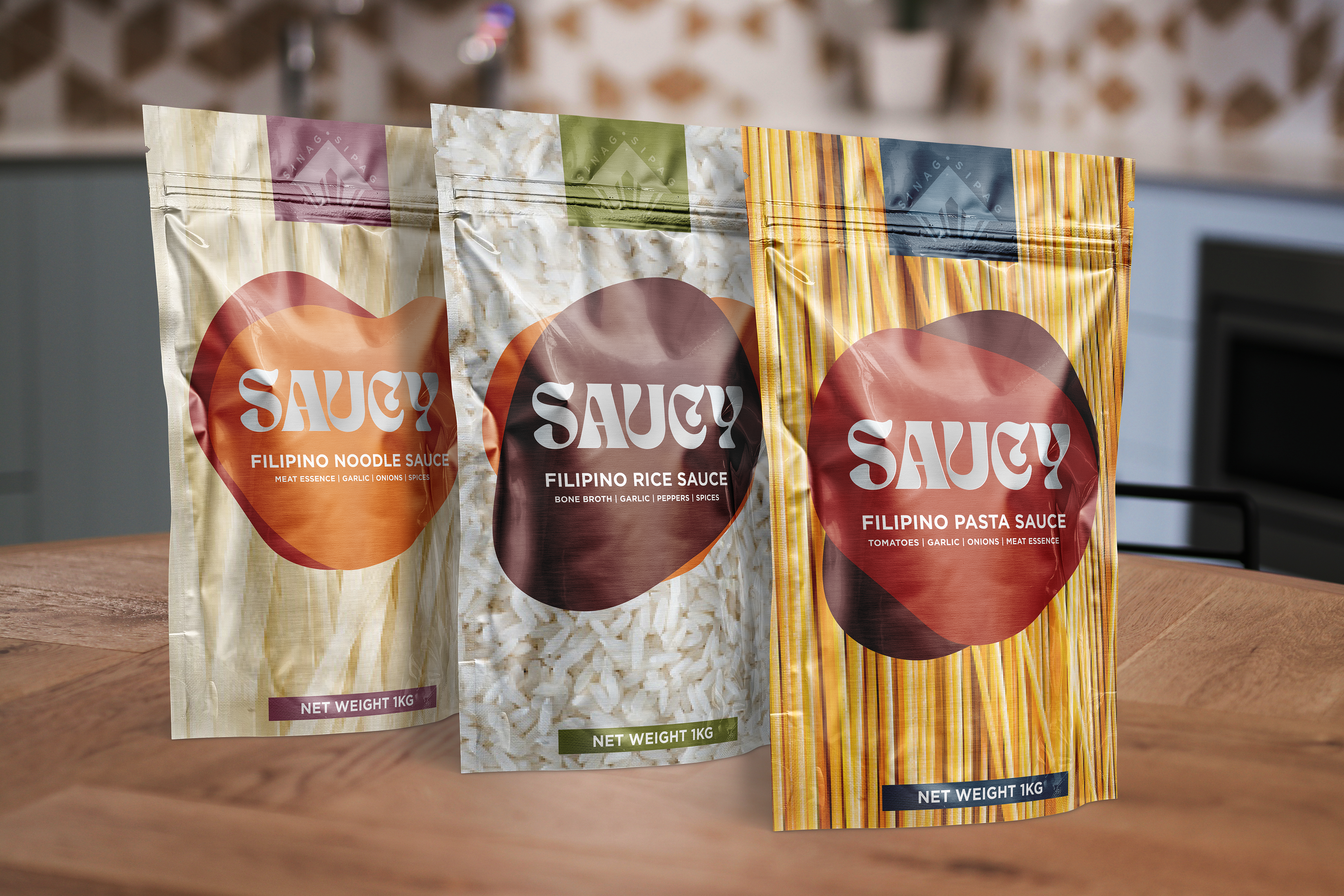
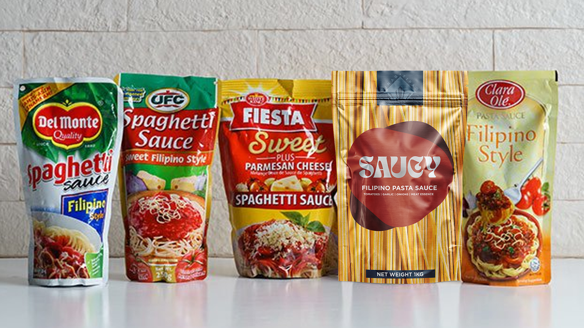
I had fun creating this brand. And just to test how it fares, I figured to drop it into a lineup of the competition to see how it would stack up.
From this vantage point, it is the clearest, most direct branding you'll ever find.