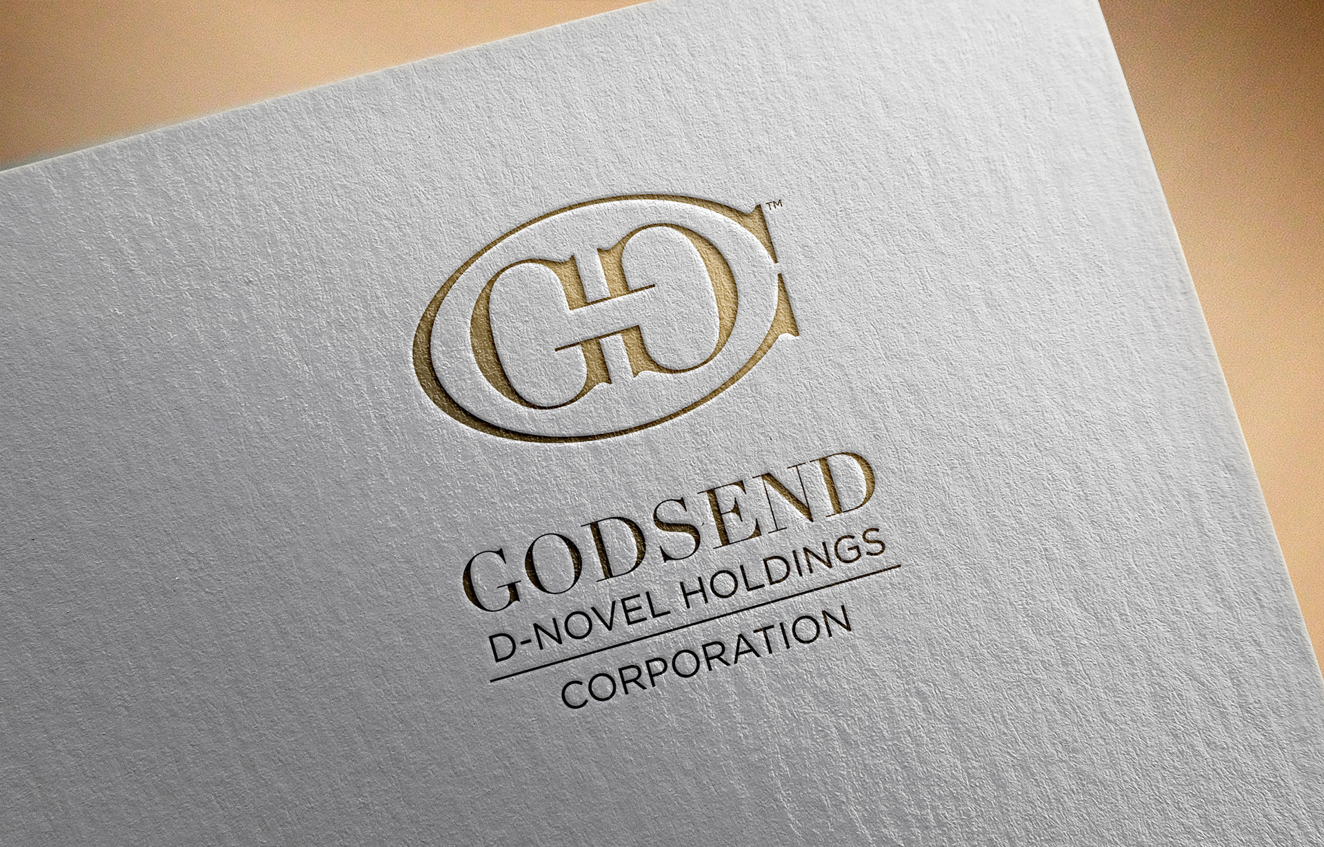
The client registered a business name with an inherent challenge when it comes to designing a brand identity for it. The name contains four words, and do not directly inform the public as to what it is about. It is a heady task to expect the brand identity of a new corporation to create an ownable mark that cues a sense of sophisticated leadership in various luxury verticals, including investments and real estate.
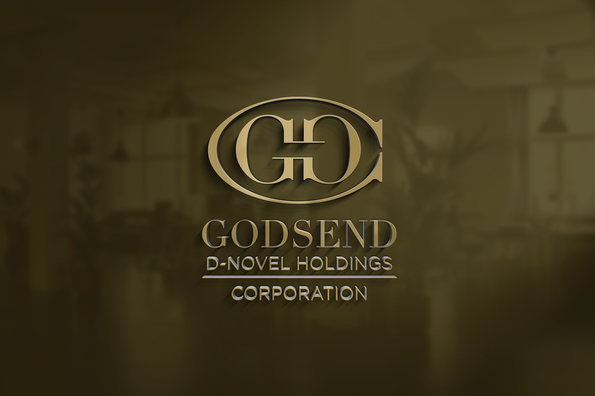
Symmetry, the use of letterforms and ligatures, and iconography all played a part in developing the final logo lockup.
To start, the simplification began with focusing on the initials of each word. Then, the characters G and D were made to reflect each other, forming a third character, H. Finally, the character C is manipulated to contain the current lockup. It is also worth noting that because of the increased width of the letter C, while being a serif letterform, the final shape resembles that of a stylized fish - a symbol of prosperity, which the client appreciated.